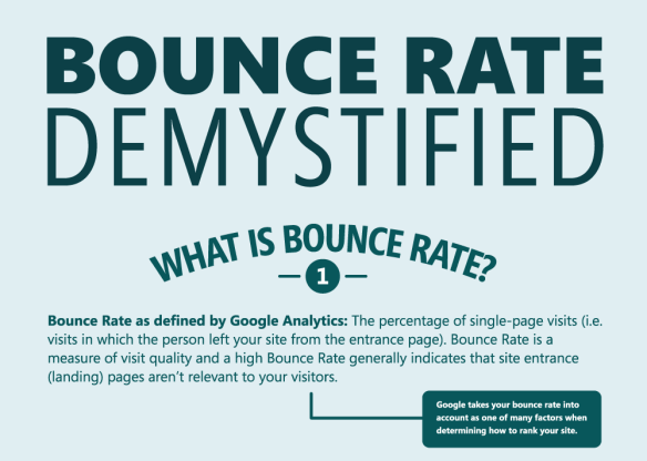
Once upon a time, it was believed that the success of a website is indicated by the number of page views. Even though getting a large number of visits is great, it is equally important to make the visitors stick around for a longer time. This is because there is no point in attracting a large number of visitors only to have them leaving immediately thereafter without bothering to engage with your site. Not only do your chances of achieving conversions become really slim but also your page rankings take a nosedive because Google factors in bounce rate as one of the parameters for its search rankings. Take a quick look at some strategies to encourage people to stay longer on your site:
Ensure the Aesthetics Appeal
When people arrive at your website, it takes them only a few moments to make up their minds whether to stay or quit. The site aesthetics is the most compelling reason for visitors to think about spending a little more time to explore the site. A poor site design is also often interpreted that the contents and the functionality will be poor too. You do not need to necessarily have a team of expensive web designers at your disposal. When you add your own sense of aesthetics by including colors and images to the selected template you can end up with a web design that’s really captivating.
Keep Upfront what’s Most Interesting
Taking a tip from news journalism, you should place the really interesting stuff right on the home page. For example, if you are an architect or an interior decorator, you should place the most interesting design that you have created right on the landing page, and use it to entice users to view your other work. In other words, you should always be thinking about how you can advertise yourself, persuade users to enter the site and stay with it and take the desired action by clicking to a CTA button.
Keep the Text Matter Short and Sweet
Remember that visitors have extremely short attention spans and they will only spend time on a site if they can quickly understand what the site contents are and decide whether it is relevant to their needs. Thus, practically speaking, there’s no point in including heavy text even though it may be detailed and potentially useful. Instead, keep the narrative short and precise without including long words and unfamiliar jargon. Remember, all your visitors may not have English as their native tongue, and you surely wouldn’t want to drive them away with complicated and long text.
Of course, do not hesitate to include long-form text if it is really helpful but make sure that it is not is sections like About Me. There is obviously no absolute formula for calculating the ideal length of the text; it depends on the industry you are in, and the position you are trying to occupy in the industry. If you must have lengthy articles, make good use of headlines and images to break it up into clearly defined sections that will reduce the monotony of reading it.
Reduce Administrative Involvement
Agreed, there is some value in collecting data regarding the people visiting your site but there is little joy if people are compelled to log in and fill up forms before they can access your site. It is usually far better to make the data collection exercise an option and instead give your users clean access to your site. What this means that you should reduce your administrative control to the bare minimum. Instead of asking people to log in with their social media or email accounts for commenting on a blog post, just allow them to post without any rigmarole.
Ensure Site Is Updated Regularly
Most visitors are unlikely to dwell on your site for long on repeat visits if they figure out that the site has not been updated. It is vital to keep on adding fresh content to keep the interest levels high. For online retailers, it is as easy as introducing new product lines or even new products in existing product lines; however, others may simply post pictures on recent events or blogs on industry trends. The main thing is to ensure that the user finds something to engage his attention when he visits the site.
Bonus Infographic:

Conclusion
If you place yourself in the shoes of a user visiting the website, it is not so difficult to figure out how to make a site appealing enough to make them stay longer and hopefully make a purchase. Right from the aesthetics of the site to having interesting content upfront, as well as easy to understand content, less administrative interference and updated contents, everything counts to keep the eyeballs riveted to the screen for a longer duration.
About the guest author:
Rick Banes is a web design consultant working for lasvegaswebdesignco.com. Rick has been responsible for a number of very innovative website design projects for clients in the lifestyle sector and writes regularly on design trends.


